Graphic legend settings
These settings are available in the following locations:
Graphic Legend Preferences dialog box (creating an object)
Object Info palette (editing an object)
Graphic Legend Style dialog box (creating or editing a style)
If a legend style is selected, only parameters set by instance can be edited (see Concept: Plug-in object styles). Parameters available only on the Object Info palette are listed at the bottom of the table.
Click to show/hide the parameters.Click to show/hide the parameters.
|
Parameter |
Description |
|
Use Style |
From the Resource Selector, double-click a resource to activate it, or click Unstyled. If a styled object is converted to unstyled, the current values are retained, but all parameters are set to By Instance to allow editing. |
|
Define Legend Source |
Opens a dialog box to specify the objects used to create the legend; see Defining the legend source |
|
Hide empty cells |
Shows or hides cells created by objects that meet the source criteria, but have no images (for example, a wall opening that has no door). It's recommended to adjust the source criteria to exclude unwanted objects, if possible. |
|
Define Legend Image |
Opens a dialog box to specify how images in the legend display; see Defining the legend image. The preferences dialog box indicates whether this setting is by style or by instance, but it cannot be edited. |
|
Legend Image Classes |
Opens a dialog box to set the class properties for images in the legend; see Changing class properties. The preferences dialog box indicates whether this setting is by style or by instance, but it cannot be edited. |
|
Image Scale |
Select the scale of the image, or select Custom and enter an Image Custom Scale |
|
Legend Title |
Enter a title for the legend |
|
Display title |
Shows or hides the legend title |
|
Title Width |
Specify whether to show the title over the first cell, or over the entire legend |
|
Arrange Layout by |
Specify whether to arrange the legend cells by column or row |
|
Fixed cell width/height |
Select to make all cells in the legend the same width (when arranged by column), or the same height (when arranged by row) |
|
Enable boundary constraints |
Select to enable the boundary constraint controls for objects in the graphic legend's layout; see Editing the cell layout |
|
Edit Cell Layout |
Opens editing mode to edit the way images display in each cell and add optional static or dynamic text fields; see Editing the cell layout. The preferences dialog box indicates whether this setting is by style or by instance, but it cannot be edited. |
|
Edit Title Layout |
Opens editing mode to edit the way the legend title displays; see Editing the title layout. The preferences dialog box indicates whether this setting is by style or by instance, but it cannot be edited. |
|
Scale Factor |
Scales all geometry in the legend by the specified factor |
|
Object Info palette options only |
|
|
Style |
Replace, edit, or remove the current style, or (for unstyled objects only) create a new plug-in style (see Custom plug-in object styles without catalog options). Editing a style changes all instances in the file that use the style. |
|
Hide style parameters |
Hides the parameters that are set by style; these cannot be edited from the Object Info palette |
|
Recalculate |
Updates the legend with the latest data from the drawing; it's recommended to recalculate legends prior to exporting or printing |
|
Filter by Viewport |
Opens a dialog box to limit the legend contents to objects from specific viewports; see Filtering by viewport |
|
Cell Visibility and Sorting |
Opens a dialog box to adjust the visibility and sorting of cells in the legend; see Changing the cell visibility and sorting |
Defining the legend source
The Define Legend Source dialog box specifies which drawing objects are used to create the legend. The legend can show one or more views of the object, or it can show a specific attribute applied to the object.
Click to show/hide the parameters.Click to show/hide the parameters.
|
Parameter |
Description |
|
Legend Source |
Select the type of object to use for the legend (for example, windows or plants) |
|
Define Custom Source |
Opens the Criteria dialog box to enter custom criteria for selecting the legend source (for example, to specify multiple object types, or to add conditions to refine the selection); see The Criteria dialog box |
|
Source Criteria |
Displays the legend formula specified in the Criteria dialog box |
|
Legend Type |
Select whether to show objects or object attributes (for example, textures or pen attributes) in the legend |
|
Reporting |
Determines how to present the selected objects in the cells. For example, if you report door objects by Configuration, the legend has a cell for each unique door configuration in the drawing. You can select multiple items—for example, door Configuration, Style, and Width. The choices available depend on the Legend type selected. For an object-based legend, the setting is optional. Object-based: Select from the object parameters (for each object type), class name, design layer name, and style or symbol name Attribute-based: Select from the available attributes Click New to add a line to the list, and then select an item from the Report by column. To reorder the list, drag the number in the # column up or down. |
|
Sorting |
Determines how to sort the cells. The list functions the same way as the one for reporting, except that you can also select the cell sort order. To specify a custom sort order, select Custom order; then click Cell Visibility and Sorting from the Object Info palette. |
|
Filter by Viewport |
Opens a dialog box to limit the legend contents to objects from specific viewports; see Filtering by viewport |
|
Number of cells |
Displays the number of cells in the legend, based on the current criteria |
Filtering by viewport
The Filter by Viewport dialog box allows you to limit the legend contents to objects from specific viewports; if no viewports are selected, objects from all viewports are included. Click the Use column next to a viewport name to select it.
Alternatively, right-click the legend, select Add Filter Viewport, and then click on a viewport to use as a filter.
Changing the cell visibility and sorting
The Cell Visibility and Sorting dialog box allows you to adjust the visibility and sorting of cells in the legend directly. When you click a row, the corresponding cell in the legend is highlighted in red.
Click to show/hide the parameters.Click to show/hide the parameters.
|
Parameter |
Description |
|
Sorting |
The settings from the sorting list in the Define Legend Source dialog box display, and can be edited here. To specify a custom sort order, select Custom order and use the Visibility and Custom Order list to arrange the cells as desired. |
|
Visibility and Custom Order |
|
|
Show |
Cells with a check mark in this column are included in the legend |
|
# |
Click and drag the number in this column to reorder the cells in the legend |
|
Report by Value |
Displays the primary Report by values for each cell in the legend, as set in the Define Legend Source dialog box |
|
Preview |
Updates the legend in the drawing to preview the sort and visibility changes; click OK to apply the changes, or click Cancel to discard them |
Defining the legend image
The Define Legend Image dialog box specifies details such as the display mode, scale, view, and dimensions for legend images. You can add multiple images to the cell layout, and then define each image separately.
Click to show/hide the parameters.Click to show/hide the parameters.
|
Parameter |
Description |
|
Source Criteria, Report by, and Legend Type |
The current settings for the parameters in the Define Legend Source dialog box display |
|
Image to Define |
If there are multiple images in the cell layout, specify which image to define |
|
Image Preview |
Displays previews of the legend images with the current settings. To preview other images in the legend, click the left or right arrows, or type the image number in the Preview of Cell field. |
|
Image Settings |
The settings available depend on the Display Mode selected. The settings for Hybrid Object Display are arranged into two tabs: General Settings and Annotations. |
|
Display Mode |
Select a display mode appropriate for the legend type and source objects. If the legend objects are incompatible with the display mode, no image preview displays. For an attribute-based legend, select which type of swatch to display (material, texture, fill, etc.). For an object-based legend, select from the following: Hybrid Object Display (symbol and plug-in object legends) Vertical Wall Display (vertical wall components, for partition legends) Component Display (horizontal components, for roof, slab, wall, or hardscape legends) Hardscape Display (top/plan views of hardscapes) Plant Image Display (images from the plant catalog) |
|
Classes |
Opens a dialog box to set the class properties for the image; see Changing class properties |
|
Detail Level |
Select the level of detail for the image |
|
View |
Select a standard view for the image |
|
Background/Foreground Render |
Select the background render mode for the image, along with the Background Render Settings desired. Optionally, select a foreground render mode and specify Foreground Render Settings. These settings work the same way they do in viewports; see Viewport properties. |
|
Windows and doors appear closed |
For Hybrid Object Display mode, select to show all windows and doors as closed; when deselected, windows and doors appear as they do in the drawing |
|
Preview Image |
For Plant Image Display mode, select which type of plant image to display |
|
Auto-dimensions |
Settings are on the Annotations tab for Hybrid Object Display mode |
|
Vertical Dimension/Position |
Select None to show no dimension, or select which parts of the image to apply a vertical dimension to, and then specify the dimension Position (non-isometric views only) |
|
Horizontal Dimension/Position |
Select None to show no dimension, or select which parts of the image to apply a horizontal dimension to, and then specify the dimension Position (non-isometric views only) |
|
Dimension Standard |
Select a dimension standard |
|
Dimension Offset |
Enter the distance the dimensions will be offset from the image |
|
Dimension Class |
Select a class for the dimension objects |
|
Floor Line |
For Hybrid Object Display mode with an elevation view only; settings are on the Annotations tab |
|
Show floor line |
Select to show a floor line in the image; the setting for Align Image Vertical automatically changes to Floor |
|
Line Class |
Select a class for the floor line |
|
Show label |
Includes a label for the floor line; also enter the Label Text |
|
Vertical/Horizontal Position |
Specify the position of the label text in relation to the floor line |
|
Label Class |
Select a class for the label text |
|
Show label in each cell |
Adds the label to each legend cell. To show the label only once on each row, deselect this option; the legend layout must be by row or have a fixed cell height, the image must use a set scale, and Align Image Vertical must be set to Floor. |
|
Scale |
|
|
Set scale |
For Hybrid Object Display mode, select this option to show all objects at a specified Scale; this illustrates the relative sizes of the objects |
|
Scale |
Select a Scale, or select Custom and enter a Custom Scale |
|
Scale to fit image |
For Hybrid Object Display mode, if some selected objects are much larger than others, select this option to automatically scale all images to be a similar size |
|
Fit to bounds of image in layout |
Scales images to the size specified in the cell layout. When deselected, scales images to the Image Height and Image Width you enter. |
|
Alignment |
|
|
Align Image Vertical/Horizontal |
For Hybrid Object Display mode, select the vertical and horizontal alignment for images in the legend. The options available depend on the View selection. For elevation views (front, back, left, right), the Floor option is available for the vertical alignment. This indicates the object's elevation relative to the floor. For top, top/plan, or bottom views, the Insertion Point option is available for both vertical and horizontal alignment. This allows you to align open doors and windows by their frames, for example. If desired, auto-dimensions can be factored into the alignment; edit the cell layout and select the option Include auto-dimensions in image size for alignment. See Editing the cell layout. |
|
Appearance |
|
|
Fit height to bounds of image in layout |
For Vertical Wall Display mode, automatically adjusts the height of the image to the boundary in the cell layout, or enter the desired Height |
|
Wall Display |
For Vertical Wall Display mode, select the portion of the wall to display |
|
Image Size |
|
|
Fit size to bounds of image in layout / |
For some display modes, automatically adjusts the height and/or width of the image to the boundary in the cell layout, or enter the desired Height and/or Width |
Changing class properties
The Legend Image Class Properties dialog box sets class overrides for a legend image similar to the way class overrides can be set for a sheet layer viewport. See Changing the class properties of sheet layer or design layer viewports.
Click Preview to update the legend in the drawing to preview the class property changes; click OK to apply the changes, or click Cancel to discard them.
Editing the cell layout
Edit the cell layout to fine-tune the image display and optionally add text fields and 2D geometry. You can create multiple images in the layout. When you add or rearrange objects in the layout, the cell frame adjusts automatically. The layout must include the frame and at least one image.
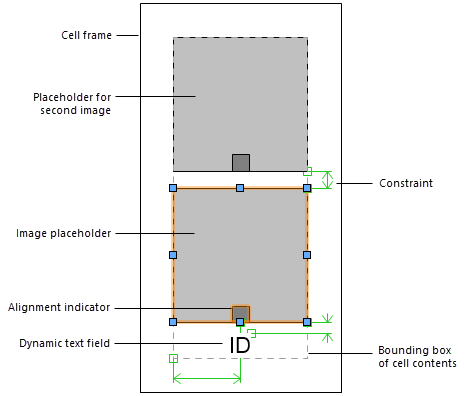
Cell layout with two images and a dynamic text field
Select the legend, and from the Object Info palette, click Edit Cell Layout. For a styled legend, see Editing plug-in object styles. The cell layout displays in editing mode.
Alternatively, right-click the legend and select Edit Cell Layout.
Select the image placeholder to access image editing options in the Object Info palette, including the image width and height, vertical and horizontal alignment, and the option to include auto-dimensions when aligning objects. Click Define Legend Image to adjust the image definition (see Defining the legend image). To see how the image will look in the legend, set the Preview Display to Detail.
Use the Text tool to add static and/or dynamic text objects to the layout. From the Object Info palette, specify the appearance of the text; see Formatting text.
Static text simply shows the text object in each cell.
Dynamic text shows data from the object in the image (for example, the window ID) in each cell, in place of the text object. To create dynamic text, select the text object and select Use dynamic text from the Object Info palette. Then click Define Graphic Legend Field (or double-click the text object) to open the Define Dynamic Text dialog box and define the field.
Click to show/hide the parameters.Click to show/hide the parameters.
|
Parameter |
Description |
|
Field Label |
Enter text to display for this field in the graphic legend layout |
|
Field Definition |
|
|
Current Field Definition |
Variables are placed in this field when you specify a data source and click Add to Definition. The definition can include multiple data sources, static text or punctuation, and simple arithmetic operators. This field definition works the much the same way as the definition in the Define Tag Field dialog box for data tags (see Creating data tag styles). To number each cell, use the Incrementing Value Data Source. To include the image scale, use the legend object's ImageScale Parameter Name. |
|
Add to Definition / Replace Current Definition |
After you select the details for a data source, these buttons add to or replace the variables in the Current Field Definition window |
|
Value Display |
|
|
Show single value |
Shows a single value for the field in the legend; if there are multiple values for the field, select Sum values to display their sum |
|
Show multiple values |
Shows multiple values for the field in the legend. Select Only show unique values to exclude repeat values Specify a Separator to add between multiple values (for example, a comma and a space) Select Place each value on a new line to show multiple values on separate lines |
Add 2D geometry such as arcs, circles, and lines to the layout, if desired.
To add an image to the layout, duplicate the default image placeholder, and then place the new image and define it as desired.
To adjust the margin between the cell contents and the cell frame, select the frame and edit the margins in the Object Info palette. The frame cannot be deleted from the layout.
The Graphic Legend Layout Constraints on the Object Info palette control the positions of the image, text, and 2D objects within the cell. The options available depend on the type of object.
Click to show/hide the constraints.Click to show/hide the constraints.
|
Constraint |
Description |
|
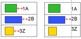
Use auto constraints |
Maintains a fixed distance between the selected object and other constrained objects. Optionally, select Align in column to align the objects. |
|
Align in column |
When Use auto constraints is selected, select this option to align objects using the distance indicated in the layout as the minimum distance between the objects.
Objects and text auto constrained without alignment (left) and with alignment (right) |
|
Constrain object distance from boundary |
If Enable boundary constraints is selected for the graphic legend, constrains the distance of the selected object from the left, right, top, and bottom cell boundary. See Graphic legend settings. For 2D graphic objects, deselect the Fix width or Fix height option to scale the object horizontally or vertically to fit the bounding box when necessary. |
When you’re done editing the layout, click Exit Graphic Legend Cell Layout.
If desired, change the legend's fill and pen attributes from the Attributes palette.
Editing the title layout
If the legend has the Display title option enabled, edit the title layout as desired. The layout must include the title frame and the Legend Title text field.
Select a legend, and from the Object Info palette, click Edit Title Layout. For a styled legend, see Editing plug-in object styles. The title layout displays in editing mode.
Alternatively, right-click the legend and select Edit Title Layout.
As described in Editing the cell layout, you can add text and 2D geometry objects and set constraints for them. For example, add a filled rectangle to give the title frame a contrasting color.
To adjust the margin between the title contents and the title frame, select the frame and edit the margin in the Object Info palette. The frame cannot be deleted from the layout.
When you’re done editing the layout, click Exit Graphic Legend Title Layout.