 Data tag settings
These settings are available in the following locations:
Data Tag Preferences dialog box (creating an object)
Data Tag Settings dialog box (editing an object)
Object Info palette (editing an object)
Data Tag Style dialog box (creating or editing a style)
If a style is selected, only parameters set by instance can be edited (see Concept: Plug-in object styles).
Data tag settings: Overall
Click to show/hide the parameters.Click to show/hide the parameters.
|
Parameter |
Description |
|
Use Style |
From the Resource Selector, double-click a resource to activate it, or click Unstyled. If a styled object is converted to unstyled, the current values are retained, but all parameters are set to By Instance to allow editing. |
|
By Style/Instance |
A graphic indicates whether each parameter is set to By Style and given a fixed value or set to By Instance and editable in the dialog box. An object style may have a combination of both settings, to balance the need for consistency and flexibility. By Style/Instance settings are established by the style and cannot be changed from the settings dialog box.
To edit the object style, see Editing plug-in object styles; editing the style modifies all plug-in objects in the file that use the style. |
Data tag settings: Leader tab
Click to show/hide the parameters.Click to show/hide the parameters.
|
Parameter |
Description |
|
Use leader |
Draws a leader line with the tag; specify the leader parameters |
|
Leader Type |
Select line, arc, or Bézier as the line type |
|
Default Shoulder Length |
Enter a default length for the leader shoulder, or enter 0 (zero) for no shoulder. After placement, you can move the shoulder control point to adjust the length. A green field entry indicates the tag units are page-based; black indicates world-based units. |
|
Leader Radius |
If the Leader Type is arc, enter the arc radius in page units |
|
Marker |
Includes a marker at the end of the leader; select the marker style; for details, see Marker attributes |
|
Clip leader by object |
Clips the leader line where it intersects the tagged object's geometry |
|
Leader/Shoulder Class |
Select an existing class, or create a new class. Select <Data Tag Class> to place the leader in the same class as the data tag object. |
|
Horizontal Position |
Specify whether to extend the shoulder left or right from the leader line; select Auto to vary the shoulder position automatically according to the tag position |
|
Move _ with Object |
Specify whether to move the entire tag or only the end of the leader line when the associated object is moved |
|
Allow multiple attachment points |
Enables the leader to attach to the tag at the nearest attachment point, defined by loci in the tag layout |
Data tag settings: Display tab
Click to show/hide the parameters.Click to show/hide the parameters.
|
Parameter |
Description |
|
Align to walls/objects |
Rotates the tag to the angle of the associated object; for walls, data tags will be rotated as if they are inserted in the wall |
|
Wall Alignment |
Specify the part of a wall for aligning the tag: centerline, left or right edge, or unconstrained |
|
Always display Edit Tag Data dialog |
Displays a data entry dialog box each time the tag is placed in a drawing |
|
Mirror elements |
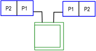
If Use Leader is selected and the Horizontal Position is set to Left or Auto on the Leader tab, select this option to mirror the positions of the defined tag elements when the tag is on the left side of the leader line. When deselected, the tag elements are always in the defined positions.
Mirrored tag on left, defined tag on right |
|
Scaling |
Adjusts the scale of the label: Symmetric changes the width and height equally by the Factor specified Asymmetric changes the width by the X Factor and the height by the Y Factor |
|
Scale text |
Adjusts the scale of the label text using the scaling factors; for asymmetric scaling, the text size is controlled by the X Factor, and the text position is controlled by both factors |
|
X/Y Factor |
Enter a factor for scaling the label (for example, enter 2 to double the label size, or enter 0.5 to reduce the label to half the original size) |
|
Use world-based units |
Specify whether the tag units are based on page dimensions or world dimensions; see Concept: Page-based and world-based units |
|
Edit Tag Layout |
Enters editing mode to define the geometry of the tag and the text fields shown on it; see Data tag layout |
Data tag settings: Auto-placement tab
Click the Auto-placement tab to specify the options for positioning data tags by default, when they are placed with All Eligible Objects or Selected Eligible Objects mode.
Click to show/hide the parameters.Click to show/hide the parameters.
|
Parameter |
Description |
|
Base Offset on |
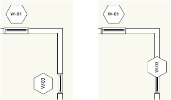
Specify whether to offset the tag relative to the tagged object's coordinate system or relative to the page axes. The Tagged Object Orientation option requires Top/Plan view.
Y offset based on the tagged object orientation (left), and Y offset based on the page axes (right) |
|
X/Y Offset |
Enter the X and Y offsets from the center of the bounding box of the associated object, as projected onto the notation plane. A green field entry indicates the tag units are page-based; black indicates world-based units. |
|
Leader Length |
If Use Leader is selected on the Leader tab, enter the length of the default leader line. A green field entry indicates the tag units are page-based; black indicates world-based units. |
|
Leader Angle |
If Use Leader is selected on the Leader tab, enter the angle of the default leader line |
Data tag settings: Defaults tab
For each dynamic text object on the tag, specify its next value (for an incrementing field) or the default value (if applicable).
Data tag settings: Eligibility tab
Optionally, use criteria to determine which objects the data tag can be applied to.
Click to show/hide the parameters.Click to show/hide the parameters.
|
Parameter |
Description |
|
Select eligible objects |
Enables use of criteria to define the objects the data tag can be applied to |
|
Define Criteria |
Opens the Criteria dialog box; see The Criteria dialog box. The specified criteria display below. |
Data tag settings: Object Info palette
These options are only available from the Object Info palette for a selected object.
Click to show/hide the parameters.Click to show/hide the parameters.
|
Parameter |
Description |
|
Style |
Replace, edit, or remove the current style, or (for unstyled objects only) create a new plug-in style (see Custom plug-in object styles without catalog options). Editing a style changes all instances in the file that use the style. |
|
Hide style parameters |
Hides the parameters that are set by style; these cannot be edited from the Object Info palette |
|
Tag subparts only |
If the tag was initially created for a subpart, this option controls whether the tag shows data for the original subpart or the entire object. This option also controls whether the Re-Associate command re-associates the tag with a main object or its subparts. |
|
Edit Tag Data |
Opens a dialog box to edit the data displayed on the tag; see Editing tag data |
Data tag layout
The layout defines the text fields and 2D geometry for the data tag.
In layout editing mode, draw the geometry of the tag in page units using any planar graphic tools. The origin (0,0) point is always the primary attachment point for a leader line, if used. To define an alternate attachment point, add a 2D locus to the geometry, and enable Allow Multiple Attachment Points in the Data Tag Style dialog box.
Use the Text tool to add static and/or dynamic text objects to the tag. From the Object Info palette, specify the appearance of the text; see Formatting text for more information about the options available.
Static text simply shows the text object on each tag.
Dynamic text shows data from the tagged object (for example, the width of the window) on each tag, in place of the text object. To create dynamic text, select the text object and click Use Dynamic Text from the Object Info palette. Then click Define Tag Field (or double-click the text object) to open the Define Tag Field dialog box. See Defining dynamic text.
Use the layout constraints on the Object Info palette to control the positions of the text and 2D objects when the size of the tag's bounding box is different from the defined size.
|
Constraint |
Description |
|
Constrain object distance from boundary |
Constrains the distance of the object from the left, right, top, and bottom tag boundary. Text objects that are aligned (horizontally or vertically) and closely spaced will automatically maintain their defined spacing. |
|
Fix width / Fix height |
When deselected, the object scales horizontally or vertically to fit the bounding box when necessary; not applicable to text |
Exit object editing mode to update the object and return to normal drawing mode.
If there is an error in the field definition, such as parameters from two different object types or properties from different IFC entities, an alert displays.
